Portrait Change

Screen shot 2014-12-11 at 8.59.17 PM

One of the paintings I did this semester was an abstract realistic painting. It’s a very strange painting, but I had fun making it. It’s definitely a different style than I normally do with my portraits. I don’t exactly know what made me add the eye, but it was a spur of the moment that turned the painting from abstract to creepy.

Here is the original painting I made earlier in the year, which had lots of colors, but had a more calm feeling.

I painted this while feeling randomly inspired! I really wanted to use lots of colors and make it more contemporary rather than accurate or realistic. I am pleased with the outcome but do not feel it is complete, so I shall be working on it while in my painting studio! Classes at DAAP have begun again and I am pleased to say that I share a studio with a peer, which is very exciting. I will bring several paintings and work on them then.The thing I didn’t like was the mouth, so I replaced it with a realistic looking eye.

DSC_0029

It’s kind of fun to make a crazy addition to a painting and see how much the language and vibe changes.

Abstract Paintings

This semester, I decided to change my painting style to be more abstract, and this was the result! Here are my favorite paintings, and some of them I keep painting over.

10551120_782307455151854_3748134933394216996_n

1532064_781736088542324_816371780348495256_n

DSC_0090

This is another painting I did this semester. My favorite part of this painting is the eyes, because they are very bright and sincere looking. This painting has a more concerned look, which I’ve haven’t done in a long time.

I don’t know why I added the dots, but I thought it was fun.

I feel as though lately in my portrait paintings, I add patterns along arbitrary colors. I very rarely do any “normal” paintings anymore.

DSC_0080

Colorful abstract portrait! I had fun painting this one. I really wanted it to be realistic, but have abstract shapes and lots of colors, without being too crazy or overwhelming.

DSC_0001

 I did an eye painting! I like how it turned out, but I will most likely work on it a little more when it dries up. I do doodles and drawings of close up eyes all the time, but I’ve never actually done a close up eye study before, so I wanted to do just that and add some color!

DSC_0006

Screen shot 2014-12-11 at 8.58.44 PM

This painting was an experiment for me. I painted on bare canvas, because I liked the way the tan peeked through the painting.I like the colorful, sensual feel.

DSC_0062

This is a painting I did for my art education course. It represents metaphors and how they lead into abstract thinking. The metaphor I chose to represent here is an iceberg effect, where on the surface, our thoughts are like icebergs, but underneath there are more interesting, abstract thoughts taking place.

I ended up painting over this painting, and now it looks much different. I liked some aspects of the painting, but as a whole the picture, it’s not a painting I want to keep forever. I’m going to continue to paint on this canvas and I’m excited to see the final result.

DSC_0333

This is a painting I have been layering for about 3 weeks. I don’t normally do abstract work, and I really want to have one good abstract painting by the end of the semester, and this is the third time I’ve painted over this canvas. I will continue to work on it, but this is the progress so far!

I enjoy some of the colors but I need to calm it down.

DSC_0094

Throwback Thursday: Mt. Adams Painting

28580_100633619985911_1162899_n

This week’s throwback piece is from my junior year of high school. This is a landscape painting from a spot in Mt. Adams, Cincinnati. I got lots of positive feedback at the time on this painting, which I did not understand. Lots liked the window & door on the middle house, and liked the energy of the piece. I hated the black gate however, and still do hate it very much. But I don’t dislike this work, I just don’t feel any special connection to it or particularly enjoy looking at it. It isn’t terrible, it is pretty decent, especially because I was just learning how to paint at this time in my art career. I would change the perspective and make the lines more straight if I were to do this composition now.

In high school, we went to Mt. Adams a few times to sketch and take pictures for studio. Mt. Adams is a great art community, and have art walks often. It is a wonderful place for artists to convene, and holds many fond memories of those fun field trips with friends.

My father in particular really enjoyed this painting, so I gave it to him for Christmas that year, and it has been in his room ever since.

Throwback Thursday: Muted Collages


P1100830

This week’s throwback is taking a look at some old collages made my freshman year studying at DAAP. This turned out to be one of my favorite projects actually! It was challenging. I am a huge fan of scrapbooking, however do not often find the time for it as much as I’d like. In 2011 I was a more avid scrapbooker, so imagine my excitement of combining my love for art and scrapbooking in one! However, my first attempts failed because they were too “busy”. We made two preliminary rounds of collaging before the final collection. Layers of pencil, marker, paint, paper scraps, and other materials were cut and readjusted to come up with the final collage designs. The final product still retained lots of pops of color, which I like very much in my work, but managed to be easier on the eyes and not so busy. Using muted toned paper along with bright colors, I was pleased with the way these collages came out.

P1100831

I believe I went on to incorporate these collages into some scrapbooks of mine, and liked the results.

Currently, I am working on a collage piece, which should be finished soon, which inspired this post. I love collage and should do more of it, it is a fun form of art that is easy to create! P1100829In the first collage, I like the subtle red squiggly lines the best. To create the smeared, ripped effect in these collages, I glued old sketches/pieces that I no longer liked and pulled them apart, which was an interesting effect!


P1100836

This collage is perhaps the most dirty of all, I remember rubbing it with my shoe on the floor of one of the DAAP studios. Ick! However it has nice muted patterns from the gross floor, which added interesting texture.P1100839This one has many fun details. I always look back and like fun line work. I don’t like how I made the two corners have collage squares leaving the rest of the paper blank, I wish I had a more clever composition.


I can’t wait to share my current collage project! Much different subject matter and approach, but I will try to use what I learned from this project and keep the new one from being too “busy” and overwhelming, as I tend to overdo it with color and lines.

Monet Mastercopy: Impression Sunrise

I painted a copy of Claude Monet’s Impression Sunrise for a friend of mine. This was a great opportunity for me to get more acquainted with landscapes. I am not very fond of landscape painting, but I am trying to expand my horizons. I am a fan of the Impressionist Movement in Art History, and find that Monet is my favorite impressionist painter. His use of color is divine in all of his landscapes. Looking at his work close up and far away are like two separate experiences in the same painting. Far away, it looks as though his work is so detailed, but up close not so much.

Monet’s Impression Sunrise is actually the painting for which the Impressionist Movement was named!

Monet-Impression-Sunrise1

I copied my painting from an image on the internet. I am not sure which color scheme is the original, because there are so many varying reproductions on the internet.

This painting was a great landscape to copy, there is a beautiful mixture of various colors. Monet’s technique is beautiful. I cannot replicate his style completely, but I was pleased with my copy. I am happy that it has a new home with my friend! This is the third time I have copied a famous painting, and it is a great way to pick up on style and interesting shapes other artists use. I tend to have less blending in my work, and less colorful grays, but I’m working on achieving better colorful grays.

Here is my version:

Image

Let It Out: Self Portrait Series

Image

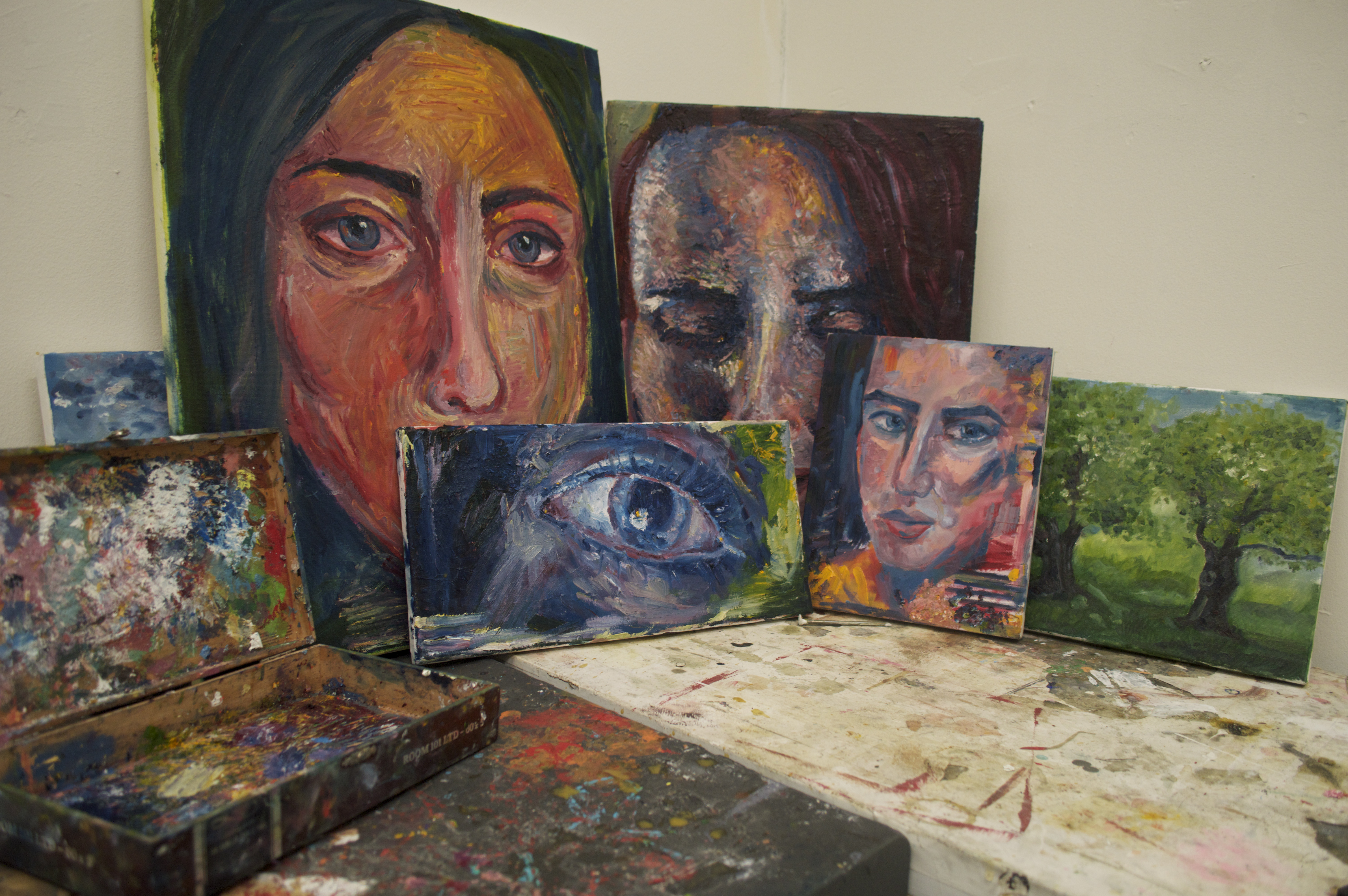
For my painting studio, I decided to focus on an emotional self portrait series. Much of my work is portraiture, and lately I have been focusing on rendering emotions in my work. The self portraits above are a reflection of a personal emotional experience I’ve had in the past year.

The past year has been a very difficult one for me emotionally. In the past few years, I have lost both my Grandmother and Grandfather, leaving me with only one grandparent, “Mama”. Losing both of my grandparents within a year of each other was very difficult for me, and in March of 2013, my Grandmother Mama was hospitalized, and things have not been quite the same since. The past 13 months have been a rollermcoaster of emotions. I was worried and scared that I might lose one of the most influential people in my life for quite some time. Then all of the sudden, I would receive news that she would be getting better, giving me feelings of relief. However, some of these feelings would be very short lived, because I would get more bad news. It seemed like just when everything was going to be alright, I would be told that there was cause to worry.

This constant change of information took a toll on me, and at one point, I was even afraid to feel anything. I felt as though every time I got my hopes up, they would just be crushed again. For a while I had shut off emotional responses to this situation. I am a “sensitive artist” if there ever was one. I have the tendency to cry a lot and get emotionally involved with everyone I love. Mama is one of the most important people in my life, and the realization that she could be gone at any time was wearing me thin.

Luckily, Mama is doing better nowadays and I get to visit her weekly. Although things are not the same as they used to be (I used to spend most of my Sundays with her going out to eat and watching classic films) I am thankful that I have had the opportunity to have more time with her. Emotionally, I am much better than I have been in the past few months. This portrait series is a way to express the way I felt for those difficult months adjusting to this scary life change.

DSC_0174

DSC_0173


The warm colored painting in the series is showing my exterior during this difficult time. Although inside I felt sadness and fear, I tried my best to put a happy face on. I gave the impression of the portrait being content, I felt painting a picture of pure joy would not relate to the series. The shy smile resembles one trying their best to mask their vulnerability. Also, I used a more blurry style while painting this, as the happy memories of me and my grandmother seemed distant and hazy at the time.

 DSC_0166

DSC_0170

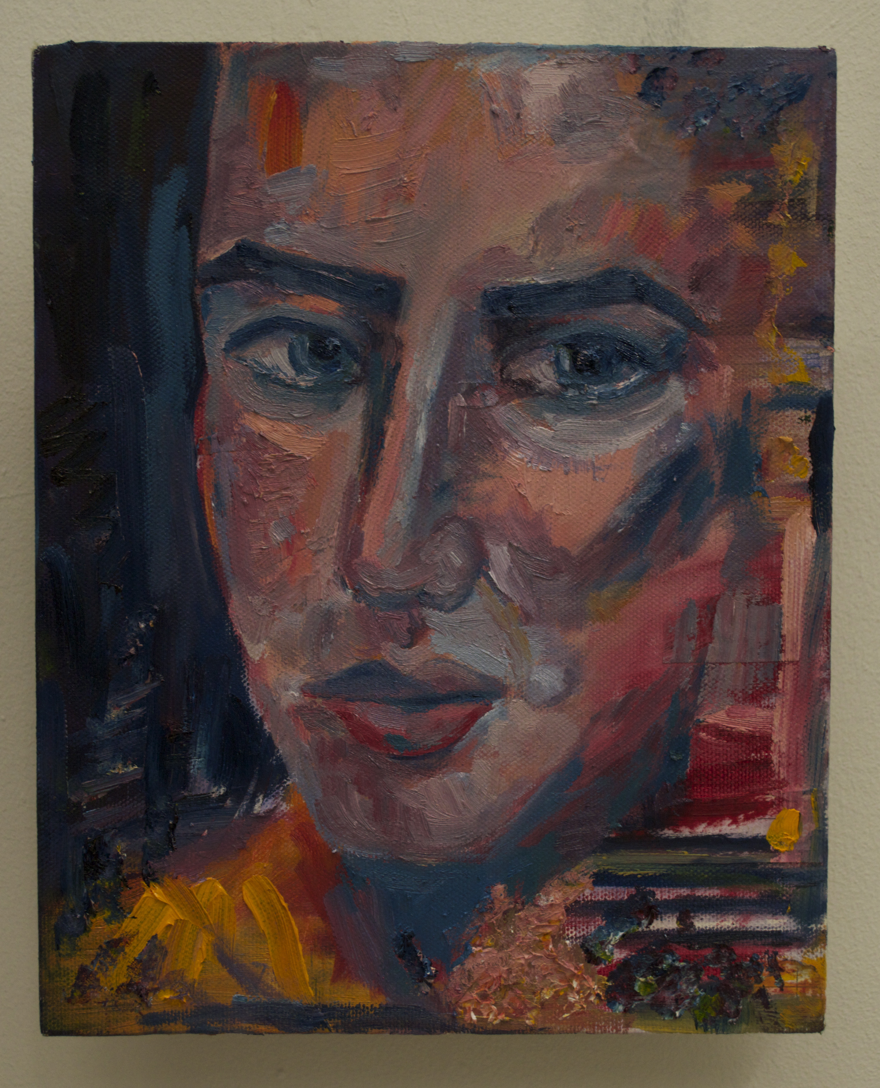
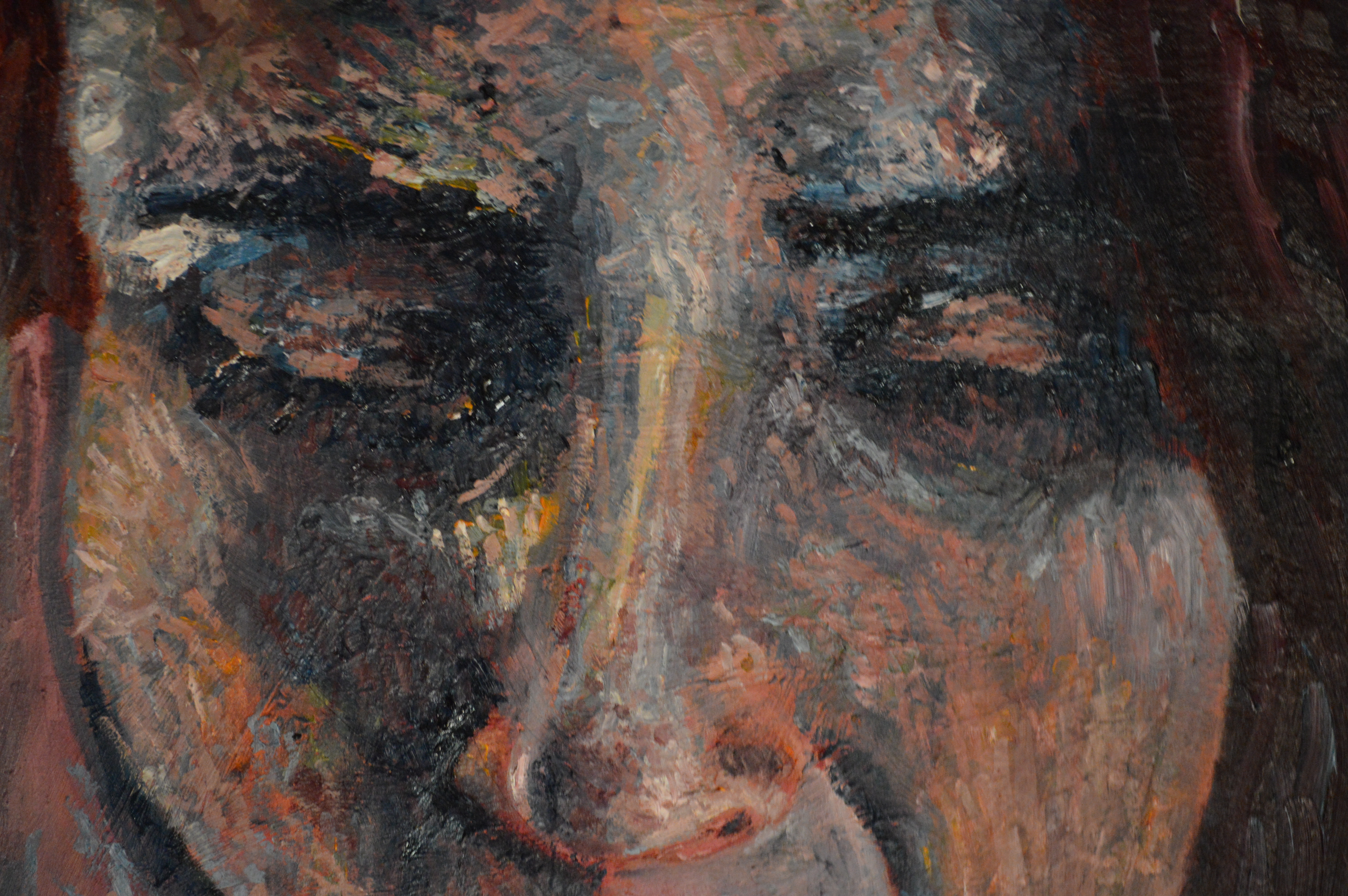
The blue colored painting is meant to have little to no emotion in the face, almost looking bored. I wanted to use a variety of blue hues to convey slight sadness. This portrait represents the depression I felt that started to settle in, and my emotions shutting off. For a time, I felt like I needed to shut off emotions to get through this situation.The blank, empty stare paired with teary eyes is exactly how I felt, struggling with sadness on the inside, but outwardly showing nothing. The style I tried to paint in mimicked a placid, bored exterior, no apparent style is visible.


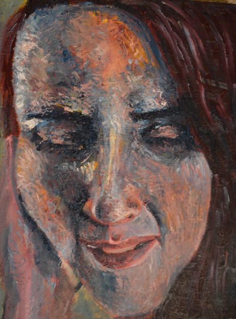
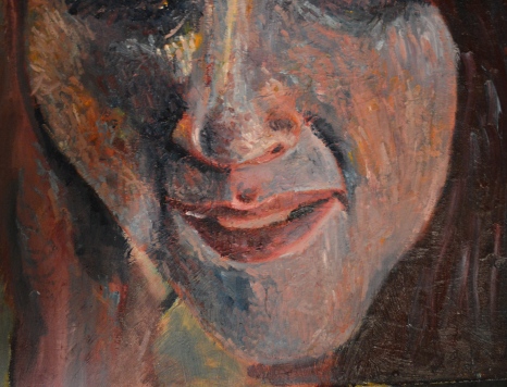
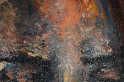
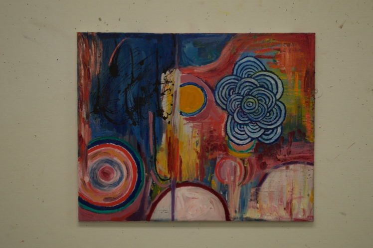
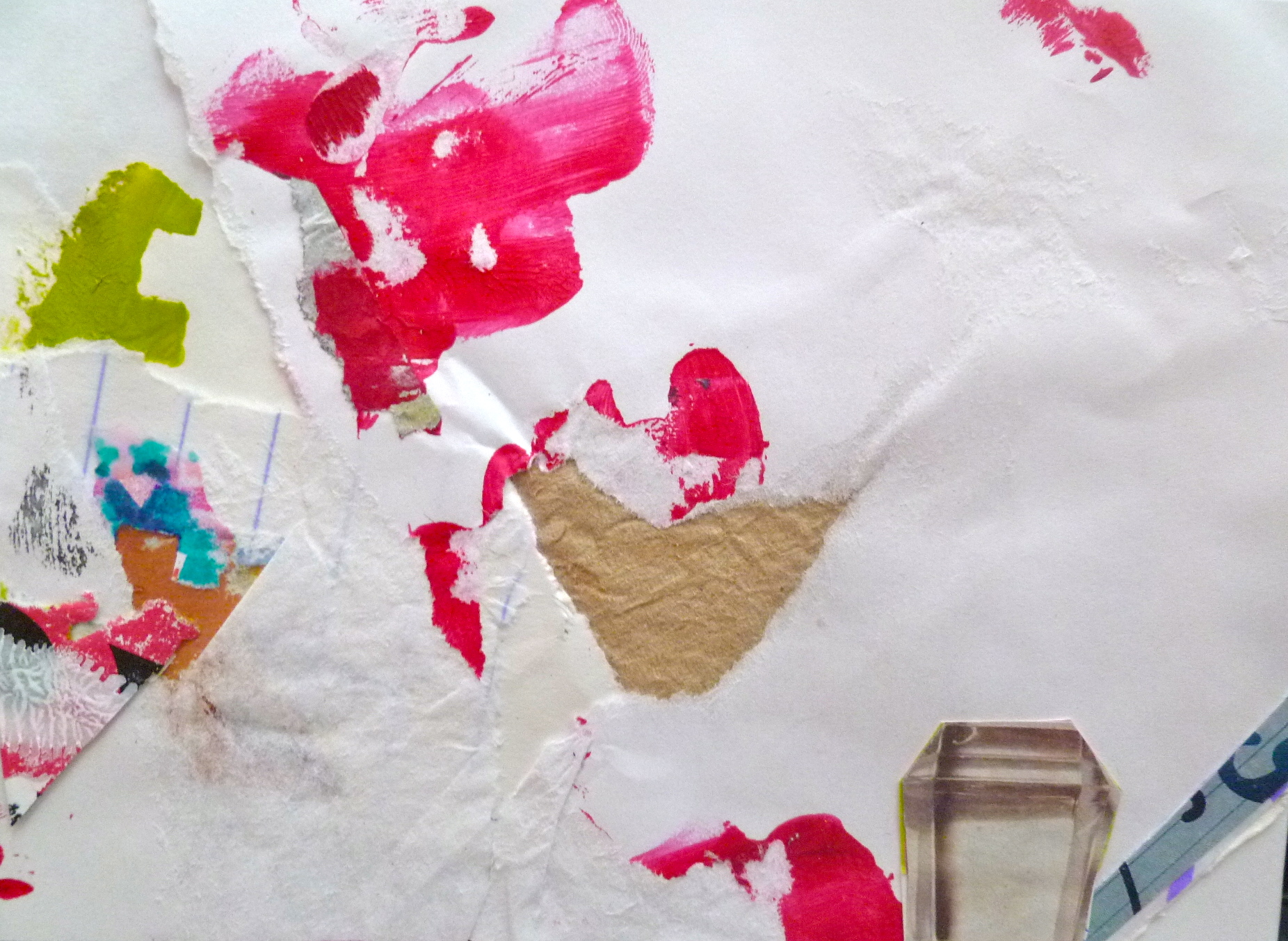
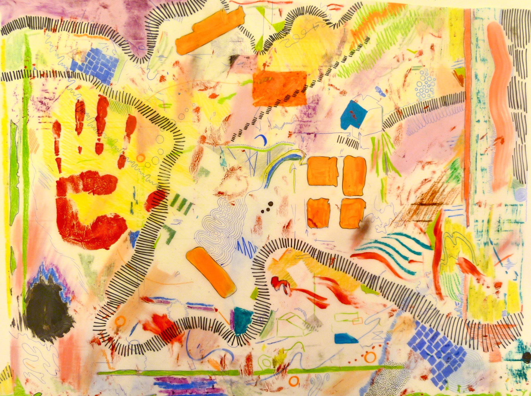
The third and final portrait best displays the inner turmoil I was feeling. I wanted to convey emotional chaos using a myriad of colors and many energetic brushstrokes. This portrait shows me crying, emotionally unstable and overwhelmed. I feel this portrait is much more intense than the other two, which are used to balance and counteract this painting. The colorful crying portrait is meant to be an extreme combination of all the sadness and fear, unmasked and on display for all to see. I purposefully made the center portrait much larger than the other two, and applied thick dabs of paint. I realized later after looking at a Van Gogh book, I had a similar style to his painterly strokes without intending it. This is my favorite portrait from the series, in a weird way this painting was a way to let all of the feelings I had bottled up out in the open. It is different than a lot of other portraits that I have done in the past, and I was excited with the result.

DSC_0223 DSC_0227

DSC_0225

DSC_0228

DSC_0229

Most of my work is created spontaneously, and I normally do not have an idea I try to convey. This work I planned ahead of time and actually wanted to have emotional meaning behind it, and was pleased with the result. I feel this series is more meaningful to me than a lot of my recent work. The series was fun to paint and was a good emotional release for me. I hope to continue to paint more portraits such as these in the future.


Throw Back Thursday: Memory Map

P1100875

This is a piece from my freshman year at DAAP, where we were to “chart” a “map” of a relationship with a person in our lives. This is a very personal piece, and it evolved into a very abstract piece. This work no longer exists, it was damaged and I used it to make another abstract piece, shown here:

P1130692I loved the second piece even more, it was an abstract map of Martha’s Vineyard, where my family has 2 summer homes. This piece was also very personal to  me, and one of my favorite abstractions I’ve created. Sadly, this piece was stolen, so it no longer exists  either.

I hope to recreate abstract pieces similar to these in the near future. Mylar is a great and versatile medium, and I enjoyed making these pieces very much.